Makepad Component
A modern UI component library for Makepad, inspired by Longbridge's gpui-component.
About Makepad
Makepad is a next-generation UI framework written in Rust, featuring:
- GPU-accelerated rendering - Custom shader-based drawing with SDF (Signed Distance Field)
- Cross-platform - Desktop (Windows, macOS, Linux), Mobile (iOS, Android), and Web (WebAssembly)
- Live design - Hot-reload DSL for rapid UI iteration
- High performance - Designed for demanding applications like IDEs and real-time tools
Production Applications
| Project | Description |
|---|---|
| Robrix | A Matrix chat client built with Makepad |
| Moly | AI model manager and inference tool |
| Makepad Studio | The Makepad IDE itself |
These projects are developed under the Robius initiative, advancing cross-platform Rust GUI development.
Features
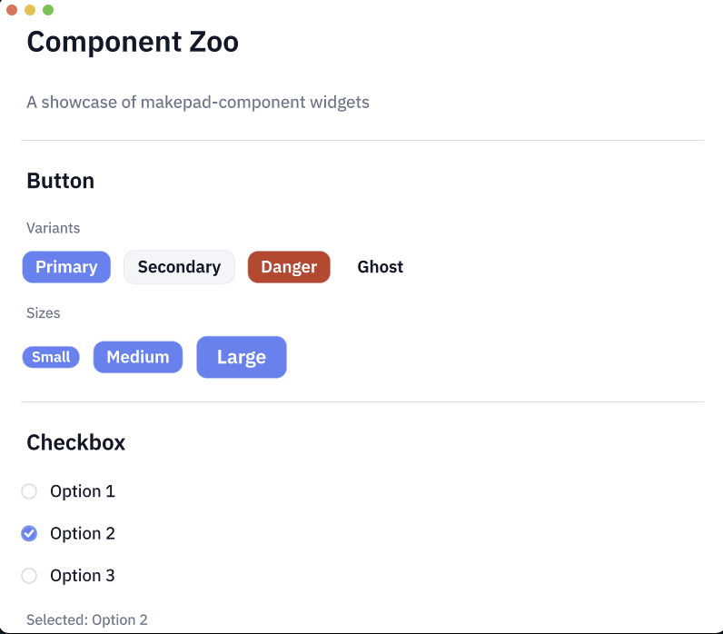
Components (v0.1.0)
- Button - Primary, Secondary, Danger, Ghost variants with sizes
- Checkbox - With label and indeterminate state
- Switch - Toggle switch with animations
- Radio - Radio button groups
- Divider - Horizontal/vertical separators
- Progress - Linear progress bar
- Slider - Single/Range mode, Vertical, Logarithmic scale, Disabled state
- Badge - Notification badges with variants
- Tooltip - Four positions with edge detection and auto-flip
- Input - Text input field
Coming Soon
- Spinner
- Modal
- Dropdown
- Select
- And more...
Installation
Add to your Cargo.toml:
Usage
Running the Demo
Desktop
Web (WebAssembly)
AI-Assisted Development
This component library was built collaboratively with AI (Claude Code) using makepad-skills.
makepad-skills is a comprehensive set of Claude Code skills designed for Makepad development, covering widget creation, shader programming, and production-ready patterns.
Inspiration
This project draws inspiration from Longbridge's gpui-component, a component library for the GPUI framework (used in Zed editor). While gpui-component targets GPUI, makepad-component brings similar design principles and component patterns to the Makepad ecosystem.
Key differences:
- Makepad uses
live_design!DSL vs GPUI's Rust-only approach - Makepad has built-in shader/animation system
- Makepad targets more platforms (including mobile/web)